
What Colors are Best For Professional Headshots?
Discover the ideal colors to wear for headshots, informed by guidance on skin tone, undertones, backgrounds, and realistic photography principles.

Find the most flattering colors for headshots with practical, expert-backed tips that work for every profession
Choosing what to wear for a headshot feels way more high-stakes than it should. One wrong color, and suddenly, you’re washed out, blending into the backdrop, or staring at a photo that just feels… off.
And honestly, most advice online isn’t very helpful. It talks about “color theory” in the abstract, but never explains how to pick a shade that actually works with your skin tone, undertone, hair color, and the background you’ll be photographed against.
Let’s clear up one of the biggest misconceptions early: navy and black aren’t the only “professional” options. Sure, they work sometimes. But contrast and harmony with skin tones and background colors matter far more than sticking to the usual corporate palette.
We’ll break down the best colors to wear for headshots based on real photography principles—contrast, harmony, color accuracy—so you can choose an outfit that looks intentional, not accidental.
And since InstaHeadshots renders colors realistically and keeps skin tones natural, avoiding that plasticky over-edited look, these tips translate directly into better results.
TL;DR:
The best color to wear for headshots is one that creates clean contrast with your background and complements your skin tone and undertone—even if it’s not a “professional” default like black or navy.
Choose saturated mid-tones (think teal, forest green, burgundy) for most skin tones, avoid shades too close to your complexion, and match your headshot outfit to the setting. With accurate lighting and natural color rendering like you get from InstaHeadshots, your chosen tone will look flattering and true to life.
What actually determines the best color for headshots
There’s no single “best color” for everyone—because color doesn’t exist in a vacuum. It reacts to your skin, your hair, your background, and even the lighting hitting your face. What looks incredible on one person can fall completely flat on someone else.
Your skin complexion sets the baseline. Pale pastels can swallow lighter complexions, while darker complexions can lose definition with colors that are too close to their natural depth. Color needs enough contrast to frame your face, not melt into it.
Your undertone—cool, warm, or neutral—decides whether a shade supports your skin or fights it. A soft emerald top on someone with warm, golden undertones brightens the face without overpowering it. Meanwhile, cool undertones pop against cobalt, plum, or charcoal.
The background matters just as much. A navy blazer against a light grey backdrop creates crisp separation and instantly sharpens the jawline. But that same navy against a dark charcoal background turns into a murky blob.
Then there’s hair color, lighting, and even fabric texture. Matte fabrics absorb light and keep attention on your face, while shiny fabrics bounce light and can wash out your features.
And forget choosing colors based on symbolism, like “blue = trustworthy.” In headshots, physical compatibility beats color psychology every time.
Why color choice matters more than people realize
Color’s effects go beyond your outfit—it affects how your face photographs. The right shade pulls attention upward, while the wrong one quietly drains definition or highlights things you’d rather not emphasize.
Contrast is a big factor. If your clothing’s too close to your skin tone, the camera has nothing to “grab onto,” and your jawline can soften or disappear. Overly light colors near a pale complexion, for example, flatten the lower face instantly.
Lighting also changes how skin tones register. Bright neons can bounce their hue right onto your cheeks, chin, or under your eyes, leaving odd color casts that look more like bad editing than bad wardrobe.
Mood and brand perception shift with color, too. Deep jewel tones feel confident and polished, while muted earth tones read as relaxed and grounded. But the vibe only works if the shade complements your actual coloring.
And the assumption that “neutral is always safe” isn’t even close. Certain beiges can make warm skin look sallow, and cool greys can clash with golden undertones or blend into a grey studio background until the whole image feels flat.
Tiny color shifts can tip a headshot toward refined or slightly “off,” even if you have ideal lighting and the best headshot background.
How to choose colors based on your skin tone and undertone
Complexion: Light, medium, and deep
Your complexion sets the baseline for how much contrast you need.
- Light complexion: Avoid colors too close to your skin (blush, beige, pale peach). They blur jawline definition on camera.
- Medium complexion: The most versatile—mid-tones and deeper shades—usually photograph cleanly.
- Deep complexion: Saturated jewel tones (teal, amethyst, ruby) create striking separation and keep features defined.
Example: A medium-complexion realtor in a slate-blue top gives off a calm, credible feel in a listing.
Undertone: Cool, warm, and neutral
Your undertone determines whether a color works with your skin or against it.
- Cool undertones (pink/blue): Navy, emerald, and deep purples brighten the face without adding redness.
- Warm undertones (yellow/golden): Earthy greens, warm neutrals, rust, and rich reds add warmth and depth.
- Neutral undertones: Most mid-tones—charcoal, teal, soft plum—are balanced and flattering.
Example: A healthcare provider with warm undertones photographs beautifully in olive, burgundy, or cappuccino.
The Big Myth: “Skin-matching tones look elegant”
They might look sophisticated in fashion shoots, but in business headshots, skin-matching tones backfire. Skin-adjacent colors flatten dimension and reduce contrast, leaving the face looking washed out, especially under studio lighting.
How hair color affects outfit choices
Hair color plays a bigger role in outfit selection than most people realize. It defines the outline of your face, so if your clothing blends into your hair—or your hair blends into the background—you lose structure fast.
- Blonde or light-haired? Watch out for low-contrast traps. A person with blonde hair wearing pale beige against a bright studio backdrop can almost disappear on camera. Blonde hair + white background + a light top = one soft mass of similar tones, and suddenly, the jawline and shoulders fade instead of framing the face.
- Dark-haired individuals have the opposite issue. Dark brown or black hair and a black shirt can look striking in person but flat on camera, especially if the background is dark too. Dark hair + black shirt + dark background = hair and clothing merge into one block, and facial features lose definition.
- Red hair needs intentional contrast. Someone with red hair wearing an overly orange or copper top against a warm-toned background can blend into a single warm wash, flattening facial structure. Red hair + deep green or rust top + neutral/light background = clear separation and makes hair and features pop.
Prioritize separation between your hair and clothes and between them and your background. That keeps your outline crisp and your face the clear focal point.
Colors that almost always work on camera
Some colors just photograph well across skin tones, hair colors, and professional settings. They provide natural contrast and flatter the face, while keeping attention where it belongs—on you, not your clothes. These are the colors to keep in mind when you’re choosing clothes to wear for professional headshots.
- Navy: A tried-and-true classic. It creates reliable contrast without being harsh. Example: A navy blazer against a light gray backdrop sharpens the jawline and draws attention to the eyes.
- Deep green/emerald: Works for both warm and cool undertones. Rich enough to pop on camera, but not overpowering. Example: An emerald blouse paired with a neutral background brightens the complexion and adds energy to the shot.
- Charcoal grey: Professional, versatile, softer than black. Example: A charcoal button-down with a soft beige background looks polished without flattening facial features.
- Soft mid-tones: Dusty blue, muted teal, and plum provide subtle color that’s not distracting. Example: A dusty blue top with a warm-toned backdrop makes skin look naturally radiant.
- Cream and off-white: Only effective if there’s enough contrast with your skin. Example: A cream blouse on medium or deep skin tones can feel fresh and clean, while pale skin may need richer off-whites to avoid washing out.
Colors to avoid and why they fail in photos
Other colors almost never translate well on camera, no matter how flattering they feel in real life. Choosing the wrong shade can steal attention from your face, flatten your features, or create visual distractions.
- Neons: A classic trap—they reflect onto your skin, leaving strange color casts on your face, like under your eyes or on your chin.
- Pure white: Can be tricky for lighter complexions. It can also wash out your neck and jawline against bright studio backgrounds, making your face appear soft and out-of-focus or even disappear into the backdrop entirely.
- Pure black: Not always your friend, despite the “slimming and professional” mantra. On camera, black absorbs shadow and flattens contours, while also collapsing facial dimensions unless you have carefully balanced lighting.
- Tight patterns: Another headache. Stripes, tiny checks, houndstooth—these are a few examples of busy patterns that can produce moire effects online (a distracting wavy distortion).
- Skin-tone-matching colors: May seem safe, but they can blur the separation between clothing and face. Pale beige on light skin or deep browns on dark skin can flatten your outline and reduce contrast, making your features less defined.
The takeaway: Avoid extremes that either reflect color, merge into the background, or kill contrast. Your headshot should frame your face, not compete with it.
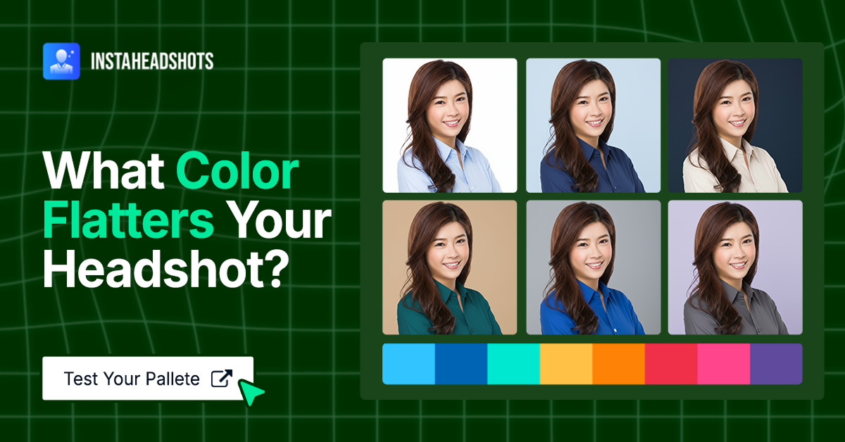
How to match clothing colors with different headshot backgrounds
Your headshot background sets the stage, so your outfit needs to play nicely with it.
- White backgrounds: Bright and clean, but pale clothing can disappear. Mid-tones and deep shades—navy, emerald, plum—create contrast and keep facial features well-defined. Light colors can work only if your hair or skin provides enough separation for a pop of color.
- Grey backgrounds: The most forgiving. Jewel tones, muted mid-tones, and neutrals all photograph well here. Grey gives enough neutrality to let both warm and cool colors shine without competing with your features.
- Outdoor or environmental backdrops: Need careful choices. Avoid greens that mimic foliage, blues that blend into the sky, and tones that are too similar to nearby architecture. Instead, pick shades that stand out—like rust, burgundy, teal, deep neutrals—to maintain clear separation from the environment.
Matching color to background ensures your face remains the sole focal point for a visually balanced headshot.
What professionals in specific industries should wear
What works in a law office would look odd in a healthcare clinic—your outfit sets the tone for your professional headshot before you even speak. You want viewers to instantly understand your professional vibe with a headshot that aligns with your industry’s visual language.
- Corporate (lawyers, financial advisors): Stick to classic, credible shades, like navy, charcoal, or deep green. These colors convey authority and professionalism while keeping your headshot focus on your face. Example: A charcoal blazer with a crisp white shirt signals competence without feeling cold.
- Healthcare: Approachability is key. Light blues, soft green, muted pastels—they all make you look calm, welcoming, and trustworthy. Example: A pale green blouse paired with neutral accessories offers a friendly and professional look.
- Realtors: You want to stand out without overpowering the viewer. Jewel tones and rich neutrals create a polished look that pops in listing photos. Example: Emerald or burgundy tops make the face bright and approachable on camera.
- Tech/startups: Aim for relaxed yet polished. Soft blue, olive, muted earth tones, and other similar shades signal creativity and professionalism without rigid formality. Example: A muted olive crewneck against a light grey background feels modern and competent—perfect for a product designer or engineer.
- Creative fields: Flexibility reigns. Plum, rust, forest green, or unexpected mid-tones let your personality shine while keeping the shot cohesive. Example: A forest green button-down on a graphic designer adds character without looking chaotic, while a rust top for an actor headshot reads bold and intentionally styled.
How AI tools handle color—why realism matters
Many AI tools struggle with color accuracy, creating skin that looks sunburned or waxy and outfits that lose all real texture. They oversaturate clothing and flatten fabric texture or shift skin tones into odd yellow or pink territory that doesn’t look natural on camera.
But InstaHeadshots is built to avoid those problems by:
- Preserving natural skin tone
- Keeping freckles and fine lines
- Maintaining real fabric texture
- Rendering true-to-life color balance
- Generating accurate lighting
So your outfit still looks like the material you chose, and your skin still looks like it does in real life.
Color realism matters because professionals need headshots that feel trustworthy. If the tone of your shirt or the warmth of your skin looks fake, the whole image loses credibility.
The idea that “AI headshots always distort color” may be true for low-quality generators. But high-end tools designed for professional output, like InstaHeadshots, handle color much more like a real studio camera.
Wear colors that help people focus on you
The right colors are the ones that highlight your face rather than your clothes. Mid-tones and jewel tones work for many professionals, since they add warmth and shape without stealing attention. But true success happens when you understand contrast, skin undertones, and background.
When your clothing supports your features, your headshot feels sharper and more authentic. It’s the difference between a photo that looks “fine” and one that instantly feels credible.
For polished, realistic headshots without booking a studio, InstaHeadshots helps you get there fast, with true colors and natural skin tones that give you professional results.
FAQs
What color looks best on everyone for headshots?
Mid-tones like navy, plum, emerald, and charcoal tend to flatter most skin tones and photograph well.
Should I avoid black or white?
You don’t have to avoid them completely, but they’re riskier on camera. Black can reduce detail; white can wash out lighter complexions.
Do patterns work in headshots?
Small or tight patterns often produce moire online. Solid colors or soft patterns layered under a blazer work best.
How do I know if a color complements my skin tone?
Test a few tops in natural light, or review your camera roll for outfits people frequently compliment—those colors usually align with your undertone.