
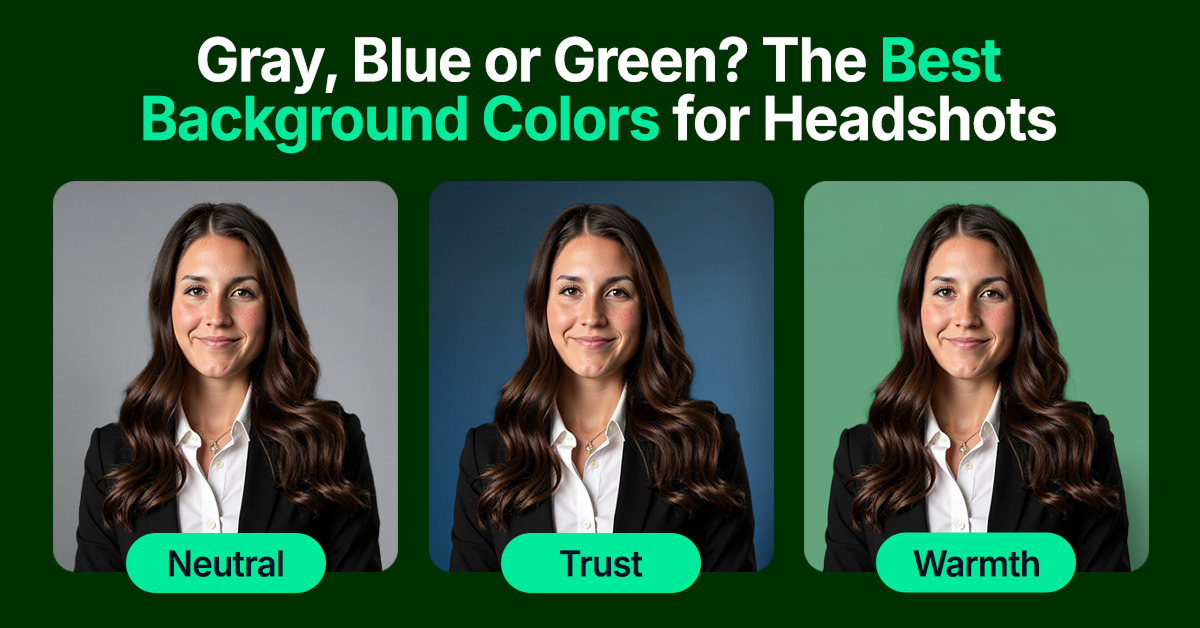
Gray, Blue, or Green? The Best Solid Background Colors for Headshots
Discover the best background colors for professional headshots. Find out how various colors influence your professional image and personal brand.

From psychology to practicality, here’s how to choose headshot background colors that enhance your professional image.

Most people don’t realize how much a headshot’s background color shapes first impressions. But it sets the tone, deciding whether you look credible, creative, approachable, or forgettable.
Too often, professionals default to flat white or uninspired gray, hoping it looks “safe.” In reality, it just looks generic and low effort.
Color, when chosen well, works hard on your behalf. Deep navy builds trust in finance. Soft green feels calm in wellness. Slate gray reads polished in tech.
The wrong shade can make your headshot photo feel dated, dull, or mismatched with your role. The right one makes you look like you belong, earning you a pause and a second look.
With InstaHeadshots, you don’t have to guess. Our AI selects high-impact, tone-flattering background colors based on your role, goals, and personal brand, so you show up sharp, credible, and instantly in sync with your audience.
TL;DR: Your professional headshot background color does more than fill space. It silently shapes how people perceive your professionalism, credibility, and personality. But the wrong choice can flatten your image or make you blend into the page.
That’s why InstaHeadshots uses AI trained on millions of professional portraits to automatically select the most flattering, role-appropriate backgrounds, so you look sharp, credible, and relevant to the people you want to reach.
Why background color matters for your professional image
Research shows that colors trigger subconscious responses, subtly communicating traits about your personality, professionalism, and how you want to be seen. The best backgrounds for professional headshots can enhance key qualities like trust, approachability, or authority, depending on what you want to project.
Take blue, for instance. It quietly signifies trust, calm, and dependability. That’s why it dominates finance, healthcare, and corporate leadership fields where confidence and reliability aren’t optional.
Meanwhile, green channels balance, calm, and approachability, making it perfect for wellness coaches, educators, environmentalists, and creatives who want to appear grounded and inviting.
This is where most professionals get it wrong by ignoring color’s power or defaulting to bland neutral backgrounds. But the right hue sharpens your business headshots and primes your audience to see you exactly how you want: credible, relatable, and ready to lead.
InstaHeadshots uses these psychological insights to tailor background options automatically, ensuring that every great headshot aligns perfectly with your goals and industry expectations.
Best background colors by effect (with examples)
Below, we break down the most effective background colors and how to use them strategically, whether you're aiming to look trustworthy, creative, or genuinely approachable.
Blue headshot backgrounds: Professional, trustworthy, and inviting
Blue is one of the most universally effective background colors for professional headshots, conveying trust, calm, and dependability within seconds. It’s a natural fit for professionals who need to project credibility and control, which is why it’s often used in industries like finance, tech, legal, and consulting.
Lighter shades of blue (like sky or powder blue) give off a friendlier, more approachable vibe that’s ideal for client-facing roles, startups, or anyone looking to appear open and collaborative. Darker blues (navy or steel) lean more authoritative, signaling experience, composure, and leadership, perfect for executive bios, LinkedIn profiles, or investor decks.
Both ends of the spectrum photograph beautifully across a wide range of skin tones, making blue a reliable go-to when you want to look sharp, trustworthy, and polished without trying too hard in your headshot session.
Gray headshot backgrounds: Neutral and polished—a safe choice
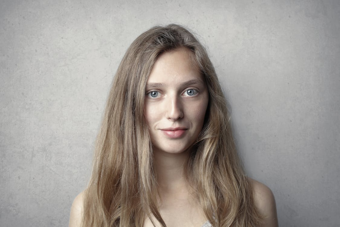
Gray is the no-risk, all-reward background color for professional headshots. Clean, neutral, and distraction-free, it keeps the attention on you. Whether you're in finance, tech, marketing, or operations, a gray background reads as professional and adaptable, making it a smart default across industries for corporate headshots.
Lighter grays create a modern, approachable feel, perfect for LinkedIn profiles, internal team pages, or client-facing roles. Darker grays, on the other hand, bring a sense of depth and formality, well-suited for executive bios, leadership roles, or resume headshots.
Because grey pairs effortlessly with both light and dark clothing, it flatters nearly every wardrobe and skin tone. It’s also ideal for AI-generated headshots, where clean tonal contrast helps your business portrait stand out without looking staged or overly stylized.
Green headshot backgrounds: Fresh, approachable, and balanced
Green backgrounds bring a natural sense of calm, balance, and grounded confidence to your headshot. Often associated with growth, renewal, and approachability, green is a powerful choice for professionals who want to project warmth without sacrificing credibility.
It’s particularly well-suited for wellness practitioners, coaches, sustainability advocates, and healthcare professionals—anyone whose role depends on building trust, connection, and emotional intelligence in a professional setting.
Mid-tone shades like sage or forest green strike the perfect balance between distinctive and professional. They photograph beautifully, especially alongside warmer skin tones, and offer a modern alternative to more traditional neutral colors like navy or gray.
Paired with simple attire, green can make your headshot feel current and memorable without pushing into overly bold territory.
Light neutrals (beige, cream): Soft, modern, and friendly
Light neutral tones like beige and cream bring a soft, welcoming feel to your headshot, which is ideal when your goal is to be seen as approachable, trustworthy, and easy to connect with.
These tones are especially effective for people-focused roles like real estate, education, and coaching, where approachability matters as much as authority. A cream backdrop suggests calm and clarity, while light beige or taupe adds a subtle richness that feels grounded but never stiff.
Because they don’t overpower your wardrobe or facial features, light neutrals let your personality lead. They also feel fresh and modern, less formal than gray or blue, but still far from casual. When paired with natural light and soft wardrobe tones, they help create a headshot that feels effortlessly confident and quietly charismatic.
Dark neutrals (charcoal, slate): Sophisticated and timeless
Charcoal and slate backgrounds strike the perfect balance between bold and understated, projecting authority without feeling rigid. These deeper neutral tones signal sophistication, precision, and long-term credibility, making them ideal for industries where trust and expertise are non-negotiable.
That’s why you’ll often see dark neutrals like slate gray or charcoal used in corporate, finance, and legal headshots. They convey strength, focus, and control without overwhelming the image. A slate gray backdrop, in particular, gives off a clean, high-end feel while keeping the focus entirely on your expression and presence. It’s polished, but not cold. Sharp, but never flashy.
These tones also photograph exceptionally well across skin tones and pair well with both light and dark clothing.
White headshot backgrounds: When to use it and when not to
White is often seen as the “default” background because it’s clean and simple. But it’s a tricky choice that can easily fall flat. Without proper lighting and contrast, white backgrounds tend to wash out your features, flatten your presence, or make the image feel clinical and lifeless, even with Photoshop adjustments.
White works best when you bring the contrast. Think bold features, deeper skin tones, or a dark, structured wardrobe that anchors the frame. In those cases, it can highlight your presence and let you shine. But show up in a pale shirt and fair skin tone, and the headshot quickly looks overexposed.
And on light-themed platforms like LinkedIn, white backgrounds disappear, making your headshot and you blend into the page. So use white only when it pairs best with your overall look or serves a particular need. Otherwise, skip the “safe” choice and pick a background color that makes you stand out for all the right reasons.
Black headshot backgrounds: Bold and dramatic—use with care
Black backgrounds command attention with bold drama and striking contrast. They deliver an editorial, high-impact look perfect for creative fields, entrepreneurs, or anyone building a strong, standout personal brand. When done right, black makes you pop off the screen with undeniable presence.
But beware. Black can also feel heavy or intimidating, especially in more conservative industries like finance or law. To avoid appearing too severe, balance the darkness with lighter clothing, open body language, and a confident, approachable expression.
Used thoughtfully, black backgrounds convey power without shutting people out. So go for black backgrounds only if you want your headshot to demand attention. Anything less, and it just feels like you’re hiding in the shadows.
Beige or taupe: Approachable and modern
Warm neutrals like darker beige and taupe strike the perfect balance between friendliness and professionalism. Softer than gray but still polished, these backgrounds create a welcoming tone without sacrificing credibility.
They’re especially effective for roles that demand authority and warmth, like therapists, realtors, coaches, and educators. These shades suggest calm, connection, and grounded confidence, helping clients and colleagues feel at ease before you’ve even said a word.
Lighter tones feel fresh and modern, while mid-range taupes add a touch of classic sophistication. Paired with simple, well-fitted outfits, beige or taupe lets your personality lead, not just your title.
Subtle gradients: Depth and dimension without distraction
Gradient backgrounds add visual interest and softness without pulling attention away from the subject. Instead of feeling flat or artificial, they bring just enough dimension to guide the viewer’s eye, making your face the natural focal point.
Especially in AI-generated headshots, where flat, solid color backgrounds can sometimes look too slick or synthetic, gradients provide that extra touch of realism. A gentle shift in tone, from slate to steel or beige to taupe, adds life to the image without overwhelming it.
That’s why InstaHeadshots uses subtle gradients by design—not for flair, but to elevate realism. Whether it’s a soft transition in blue, gray, or beige, these backgrounds help your headshot feel more polished, professional, and natural without ever looking staged.
How to choose the right headshot background color for you
Ready to choose the perfect background for your headshots? Check out some professional headshot examples for inspiration. And if you want to tailor your background even more to your profession, brand tone, or features, here’s how.
Consider your profession
Some industries naturally align with specific tones that reinforce the traits clients or colleagues expect to see.
- Corporate/finance: Gray and navy blue – These shades communicate trust, precision, and professionalism. Great for resumes, LinkedIn, or company bios.
- Healthcare: Light blue and sage green – These colors feel calm, empathetic, and reassuring, ideal for doctors, nurses, therapists, and wellness experts.
- Legal: Dark gray and navy – Darker neutrals convey authority and discretion, perfect for lawyers, compliance officers, or corporate advisors.
- Creative/agency: Green and unique blues – More vibrant backgrounds reflect creativity, openness, and personality without losing professionalism.
- Real estate/coaching /education: Warm browns and approachable greens – These colors suggest warmth and trustworthiness, which are important for people in client-facing or guidance-driven roles.
Think about your personal brand
In addition to matching your profession, your headshot background should also reflect the kind of presence you want to project. Are you bold and expressive? Calm and grounded? Strategic but approachable? The right background color helps signal that without saying a word.
- A creative coach might choose a warm taupe or soft green—something energizing yet grounded.
- A startup founder could lean into slate blue or charcoal to convey focus, clarity, and polish without feeling too rigid.
- A wellness expert might opt for a sage green or soft beige to radiate calm and approachability.
- A corporate consultant may prefer navy or gray background colors that show authority, experience, and trustworthiness.
The key is consistency. If your tone online, in conversation, and in your pitch is warm and candid, your headshot should reflect that. But if you’re known for decisiveness and confidence, a darker, more structured palette reinforces that edge.
Choose colors that flatter your features
The right shade should complement your skin tone, contrast your wardrobe, and highlight your face, not compete with it.
- Fair skin tones look best with soft, muted colors like cool gray, sky blue, or sage green. These tones create gentle contrast without washing you out.
- Medium skin tones pair beautifully with rich neutrals and warm shades—navy, olive, or tan—that create balance and depth.
- Deeper skin tones shine against vibrant hues and high-contrast backdrops like cobalt blue, golden beige, or forest green. These bring brightness without overpowering your features.
Hair color matters too. Light hair pops better against darker colors or richer tones, while dark hair can get lost on black or charcoal unless there’s enough facial contrast to hold focus. Your wardrobe should anchor the frame. If you're in a pale shirt, opt for a mid-tone or darker background to avoid blending in.
InstaHeadshots takes the guesswork out of all this. Our AI automatically evaluates your coloring, lighting, and style to select backgrounds that enhance contrast, complement your features, and bring your face forward instead of fading it into the background.
Common headshot background color mistakes to avoid
Avoid these all-too-common pitfalls when choosing your headshot background:
- Clashing with clothing: A busy shirt on a similarly vibrant background draws focus away from you. See which colors are best to wear for your professional headshots.
- Distracting patterns or textured backgrounds: They draw attention and make the image feel less polished.
- Poor lighting that distorts color tone: Even subtle tints can shift hues, making a smart blue look muddy or a warm beige look dingy.
- Backgrounds that don’t fit the platform: A white backdrop on LinkedIn’s light-mode layout simply disappears, along with your impact.
Or use InstaHeadshots to generate dozens of professional-level headshots in minutes, without the stress. Here’s how we handle it for you:
- No background setup needed: Forget studio lights, expensive equipment, or mood boards for your photoshoot.
- Industry-aligned presets: Enjoy 1,000+ outfit‑and‑background combinations that auto-adapt based on your role, whether it’s in finance, wellness, or a creative field.
- Built-in color theory: Our system considers lighting, contrast, and color harmony to automatically select a background that flatters your features and wardrobe and works across LinkedIn, resumes, slideshows, press kits, and speaker bios.
- Professional polish, no design skill required: Gradients, depth, and tonal balance are handled by AI trained on millions of human portraits. No washed-out whites, harsh shadows, or unexpected color clashes.
Get the perfect background color with InstaHeadshots
The right headshot background color can signal credibility, warmth, or creativity before you say a word.
If you’re in finance, gray and navy blue convey trust and precision. In wellness, soft green radiates calm and approachability. For creative professionals, richer tones like slate gray or unique blues spark innovation and confidence. But choose the wrong background, and you risk blending in or, worse, sending mixed messages about who you are.
That’s where InstaHeadshots shines. Drawing on color psychology and current industry trends, our AI automatically offers background options tailored to your profession, personal brand, and features, so you never have to second-guess your color choices.
Whether you want to look approachable, authoritative, or innovative, InstaHeadshots ensures your headshot hits the right note every time.
Take the stress out of first impressions. Try InstaHeadshots now and get the background color that works as hard as you do.
InstaHeadshots has delivered over 4,392,249+ stunning headshots for 50,000+ professionals
We want you to know that you are in good hands. Our only promise is to leave you impressed with your headshots and come out happy on the other side.
Create your Headshots Now